INTEGRITY AI CONSULTING BRAND DESIGN
Integrity AI is a recently launched AI consultancy company that works “at the intersection of policy, ethics, and AI – helping organizations build responsible systems and raise the standard for AI literacy and governance.”
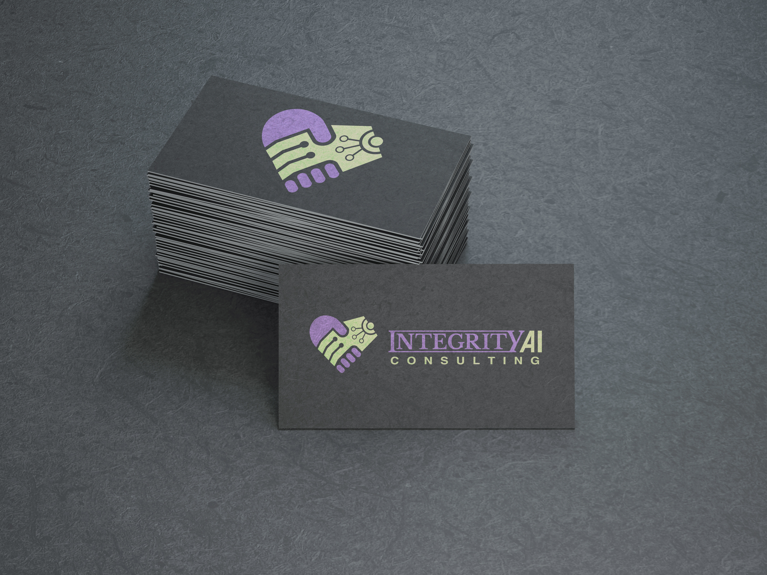
The deliverables requested for this design project included a logo/word-mark lockup, a colour pallet consisting of 5 colours with emphasis on 2 dominant brand colours and a brief brand package with suggestions for typography, design rules, and guides for logo use.
The logo/word-mark were designed to reflect the companies goals and intentions through forms which emphasize the meaning behind the word integrity while also expressing a beneficial and ethical relationship between AI systems and users. The brand design achieves an approachable visual identity through its simplicity of form and friendly/professional colour scheme.
The logo icon depicts a human and mechanical handshake which comes together to form the shape of a heart expressing an ethical relationship between AI systems and users.
The word-mark was designed to express integrity through its structure. the connection of serifs between the “I” and “Y” at the beginning and end of the word emphasizes the inline and solid structural qualities of the typeface used within the word mark.
The combination of Libre Baskerville a transitional typeface and Helvetica with a contemporary twist expresses the notion of bringing traditional values into contemporary contexts. The slanted “A” within “AI” furthers the structural integrity of the word mark while also subtly referencing the common use of the forward slash within coding language as it relates to AI programs.
Process works & design evolution
Design was too complex & heart form maybe associated to themes of love

Courthouse & connection to AI may not be immediately identifiable

Needed more distinction between the mechanical and human hands


