
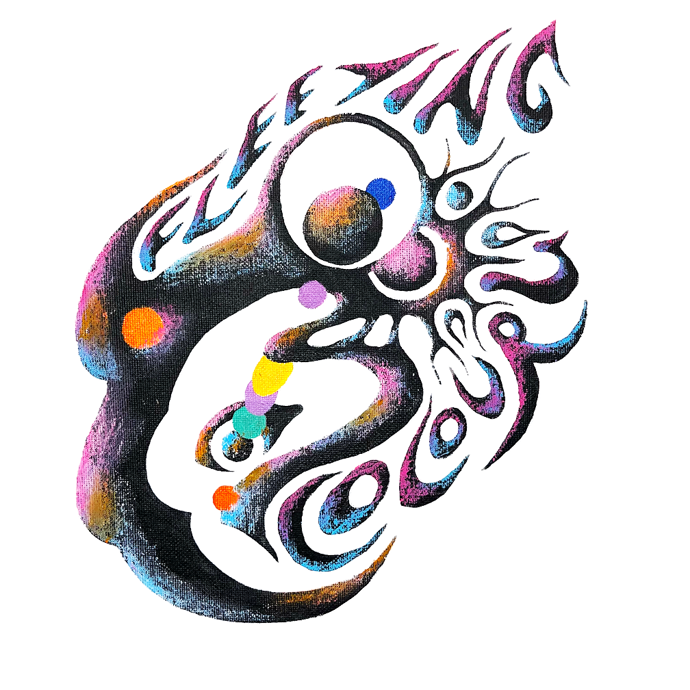
Fleeting Colours visual identity

Within this publication I explore relationships between sensory experiences by conducting methods of visually designing music. Through experimental research into form, color and typography I explore the inter representational qualities of sound, form, color and tone to devise a visual identity directly informed by Fleeting Colours musical style.
Research into visual design included both experimentation within the digital and physical realm as well as insights into possible applications of biomimicry to further representational accuracy. Fleeting Colours musical style is characterized by blending layers of distorted tones and vocals to produce a hazy, immersive sound. Their music is colorful, abstract and emotionally evocative.
Throughout this project I allow these aspects of musical identity to inform my design decisions resulting in a cohesive yet dynamic visual identity. With conclusions derived from my experimental process within part one, I set out to create a series of design productions. These include merchandise such as clothing, stickers and accessories, album design, promotional material and motion media.
Graphic Tee
Graphic tee promoting the release of Fleeting Colours latest single “Stay”.
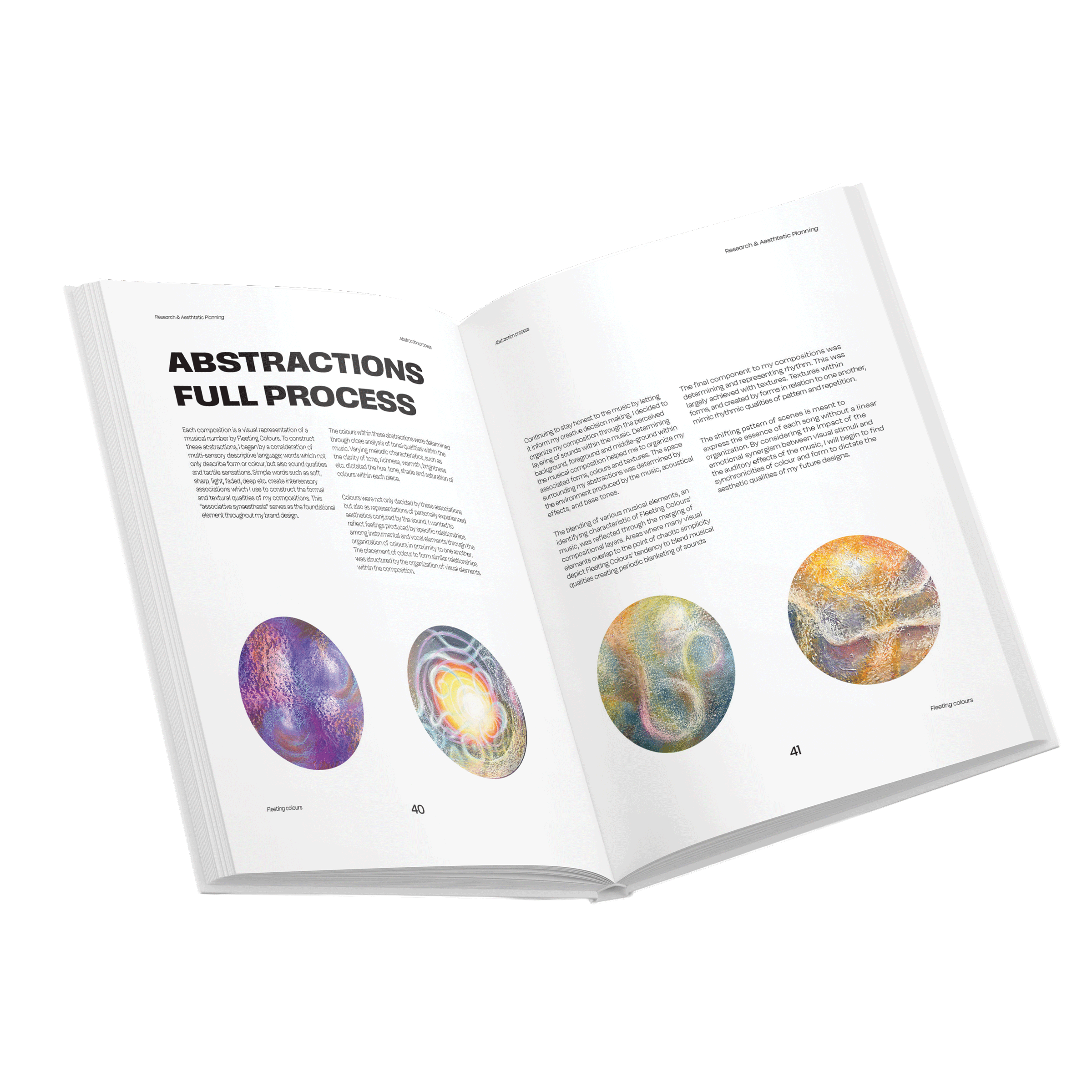
My goal with the design of this shirt was to create a wearable piece of music. I created a series of abstractions, each representing a time section within the song based on correlations between the music, color and formal qualities. I then arranged these abstractions in chronological order to illustrate the progression of the song in a visual format. The abstract design which I felt best represented the whole song, I used as the dominant graphic on the front and back of the shirt.
Keeping the front semi minimalistic I wanted to highlight the band name as the most prominent graphic element. On the back I did the same with the song name using the same distorted typeface I designed during my process. On the back of shirt graphic, I overlayed the lyrics using a specific typographic composition which adheres to the way each lyric is sung and their level of clarity in relation to the instrumentals.
Back
Front


Process Book
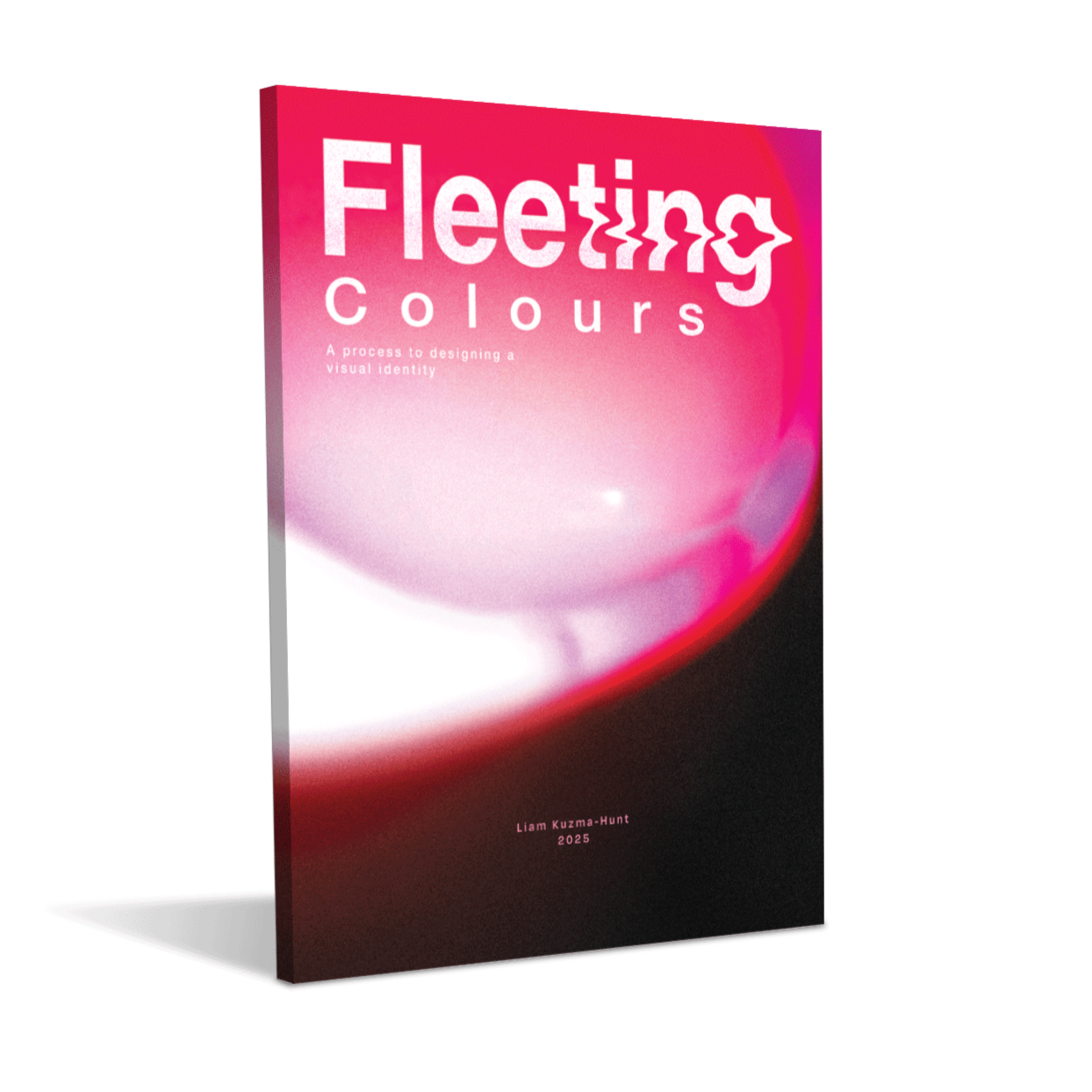
This self-publication covers the entire process of designing a visual identity for Fleeting Colours including all research and experiments with form typography and the inter-representational qualities of the senses. Part one covers all research and experimentation leading to a functional design system used to achieve a dynamic yet cohesive visual identity influenced by the bands unique musical characteristics. Part two of my process covers all steps, intentions and ideas leading to the design productions which communicate the bands visual identity. The physical book was self bound, trimmed and designed.


Design productions include:
MERCHADISE
PRINTED PROMO FLYERS
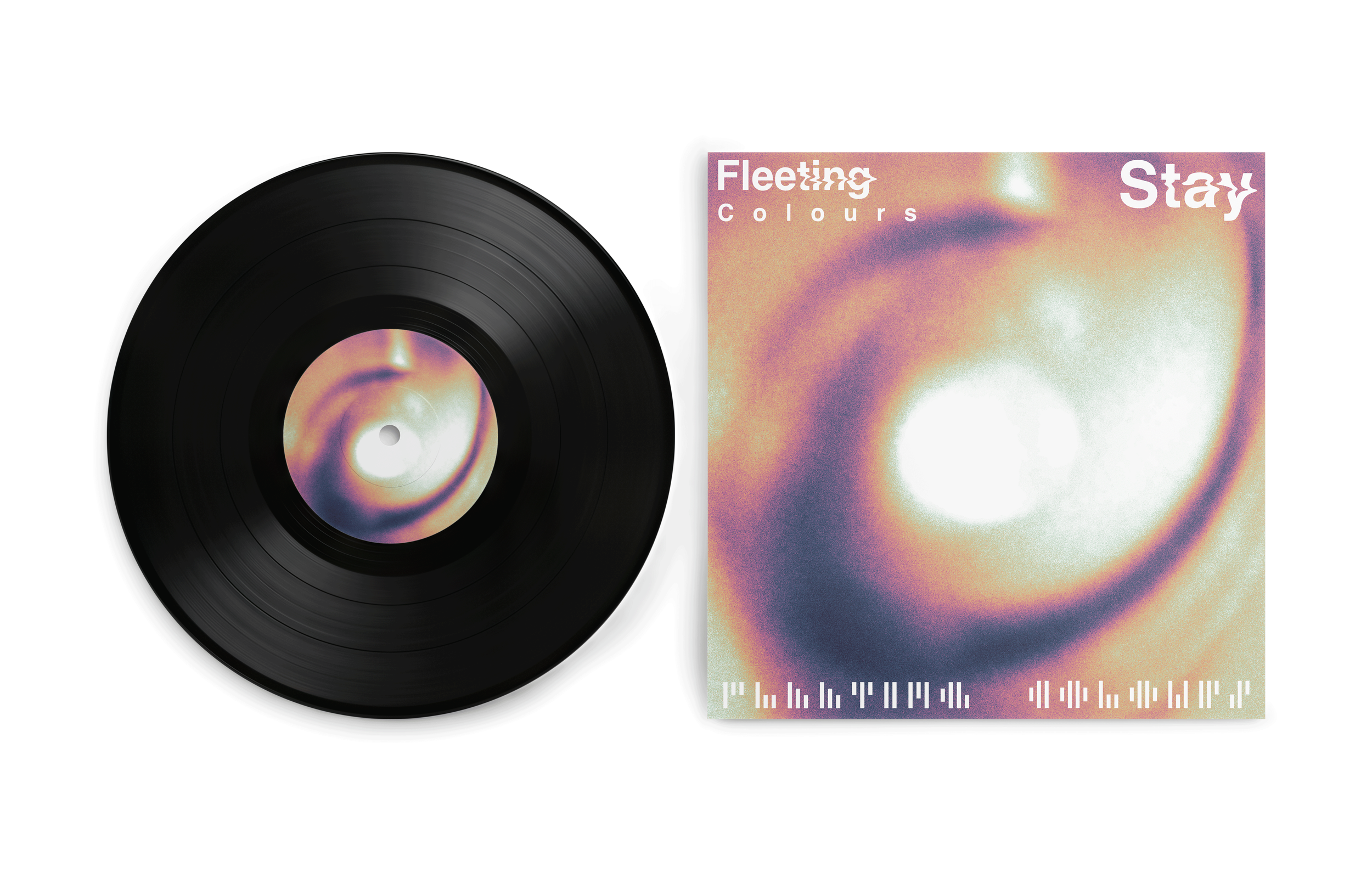
COVER ART
Cover art designed through abstract photographic practices. Using distortive elements such as light refractions shadows and water to create abstract and musically descriptive compositions. Following my ideation determined within my process, the cover art follows visual rules determined by musical associations.

trials and experiments


Final design
Graphic tee 1
First graphic tee designed for Fleeting Colours in order to promote their band and sell at shows. This was a physically illustrated graphic created before designing the bands full visual identity.
Mockups and trials

